
The creative foundation behind my product design
Every designer has a story before their current role. Mine began in visual design. Over two decades, I created branding, packaging, publications, and marketing campaigns for global organizations. That foundation continues to shape how I solve digital problems, with clarity, simplicity, and thoughtful visual communication.
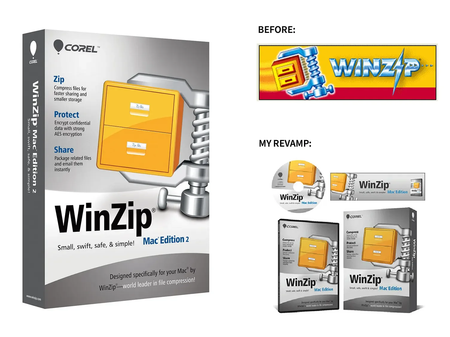
The packaging for WinZip Mac Edition took a distinct visual direction from its Windows counterpart. A larger, angled version of the iconic vice graphic extends across the front and spine, creating a strong sense of continuity. A brushed metal finish replaces the traditional background treatment, while the beveled logotype gives way to bold Helvetica Black typography. Together, these design decisions create a cleaner, more contemporary aesthetic that reflects the simplicity and sophistication of the Mac platform.
Package & Logo Update
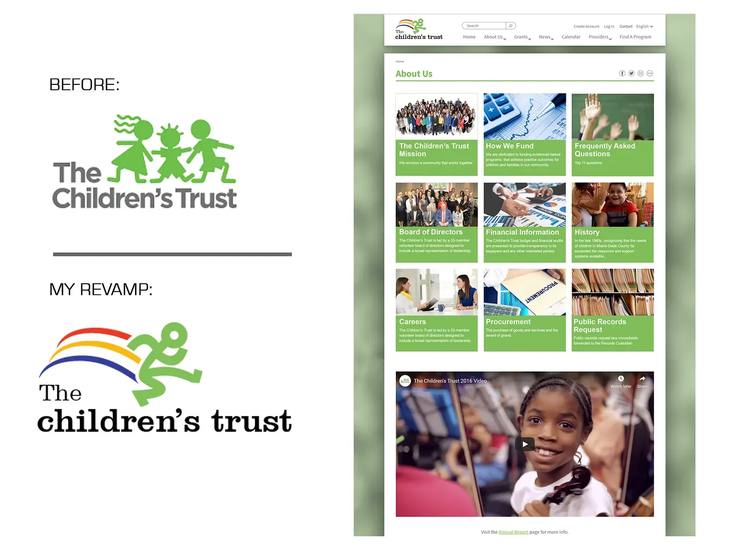
The original Children’s Trust logo relied on dated graphics and typography that did not reflect the organization’s forward-thinking mission or connect with today’s audience. As part of an interview process with The Children’s Trust, I developed a proposed logo update that explored how the organization’s visual identity could better reflect its mission and connect with contemporary audiences. While the concept was not adopted, it demonstrates my approach to simplifying complex brands while preserving their core values.
Logo update
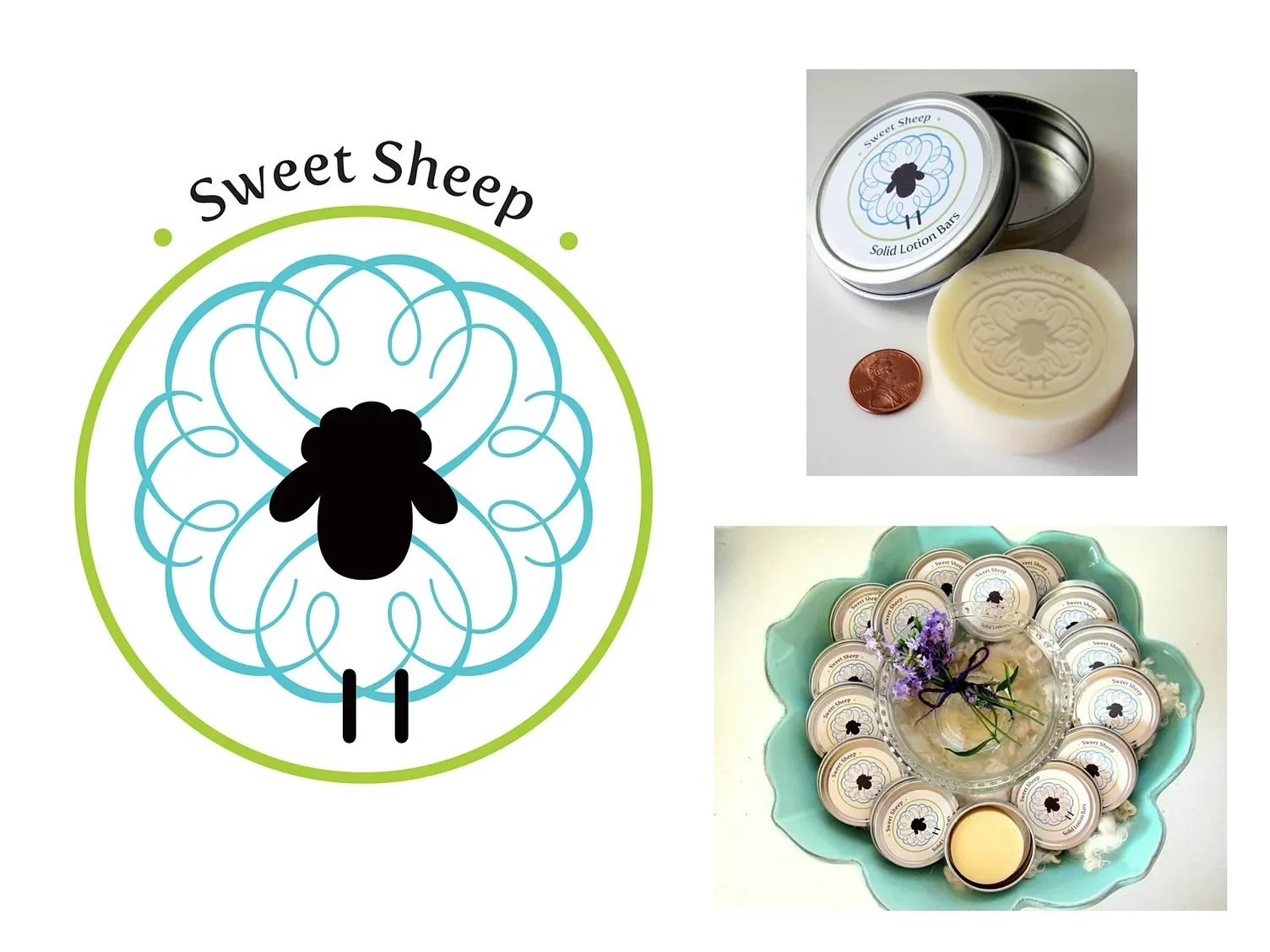
Sweet Sheep is a line of all-natural, handcrafted lotion bars formulated with lanolin—one of nature’s most effective moisturizers and the collection’s signature ingredient. The brand name draws inspiration from lanolin’s natural source, which is extracted during the processing of sheep’s wool.
The packaging centers on a stylized sheep illustration whose flowing curves reflect the collection’s feminine, floral, and clean fragrance profile. Its circular form creates a cohesive visual identity while serving a practical purpose: it provides the perfect format for the lid label and is also used as the stamp impressed into each lotion bar, reinforcing the brand at every touchpoint.
Logo & Package Redesign
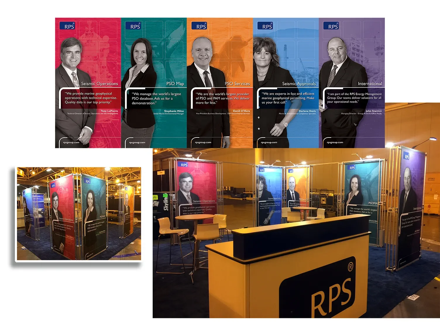
Rather than relying on generic technical imagery, the booth design featured real RPS employees to create a more authentic and approachable brand presence. Developed for the Society of Exploration Geophysicists (SEG) Conference, the exhibit showcased RPS’s expertise in the energy sector while putting the people behind the work at the forefront. Because the featured employees were also attending the conference, visitors could meet the individuals represented in the graphics, reinforcing credibility and encouraging meaningful conversations.
The visual system paired black-and-white employee portraits with vibrant, discipline-specific backgrounds overlaid with subtle graphic textures. This contrast highlighted each person’s area of expertise while adding energy and visual impact, helping the booth stand out in a highly competitive trade show environment.
Logo Redesign
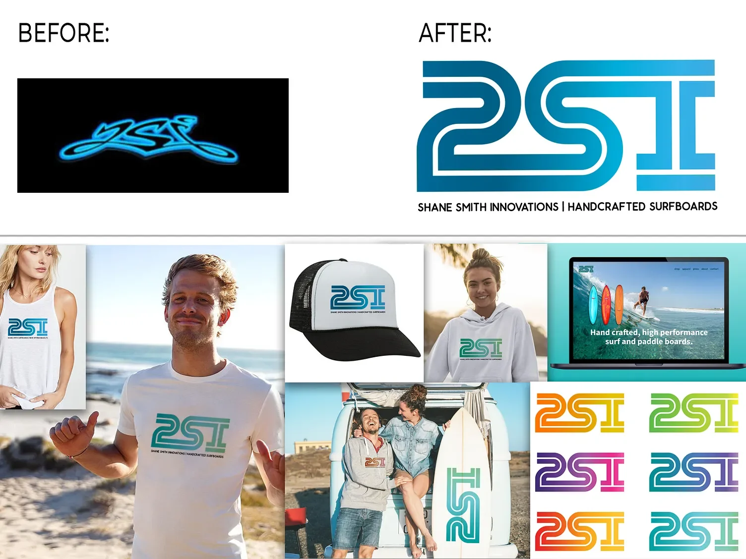
This project involved redesigning a previously graffiti-inspired logo that lacked legibility. I retained its organic, flowing essence while updating the style for greater clarity and modern appeal. The result is a clean, simple mark that is highly versatile across applications. By emphasizing readability and contemporary design, the new logo is memorable, timeless, and well-suited to the brand’s identity.
Branding
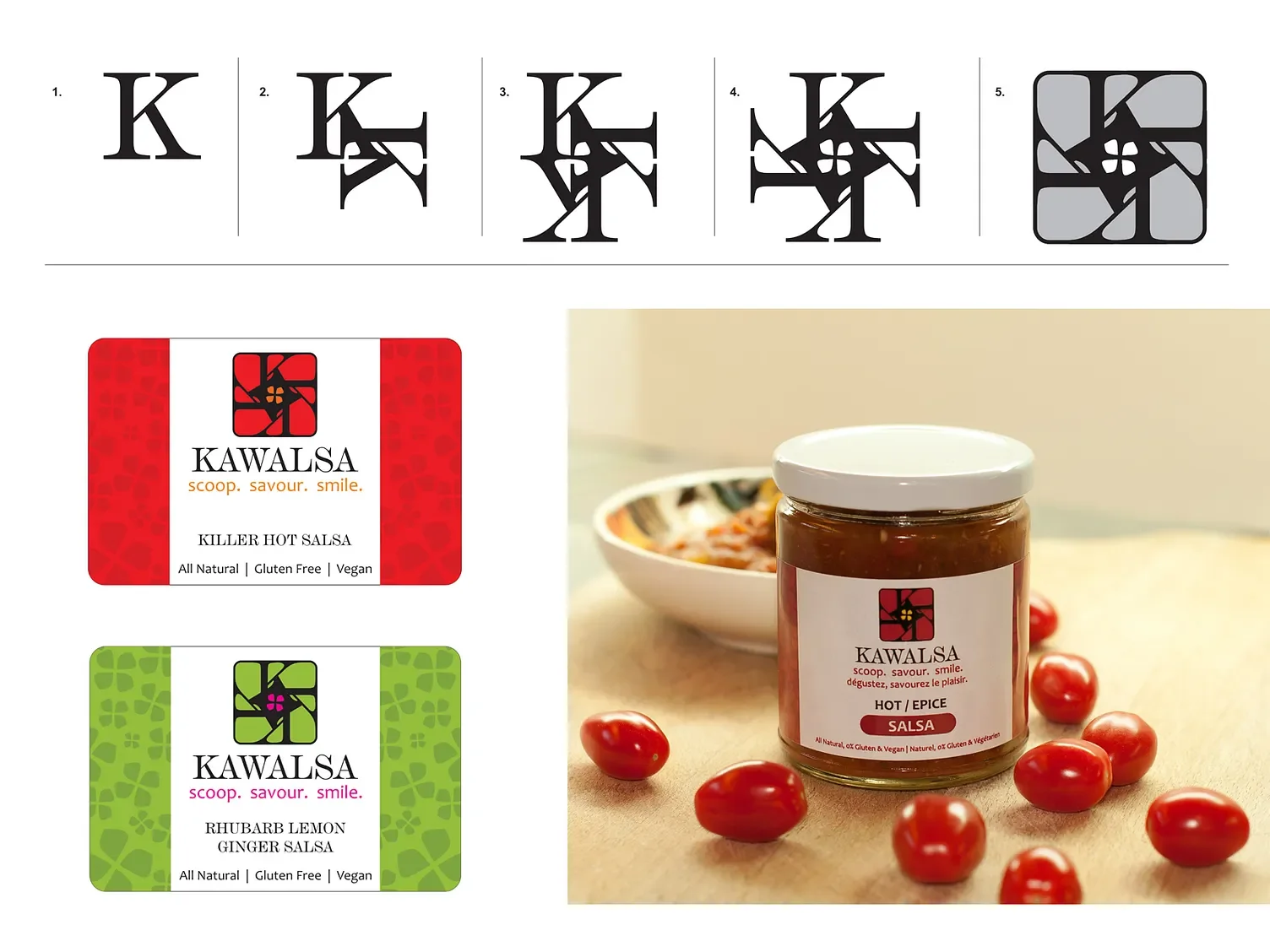
I created a complete brand identity for Kawalsa, an all-natural salsa company, including the logo, packaging, website, business cards, and trade show materials. Inspired by the letter “K,” the flower mark reflects the brand’s organic focus while creating a memorable and versatile identity across every customer touchpoint.
Tradeshow Booth Design
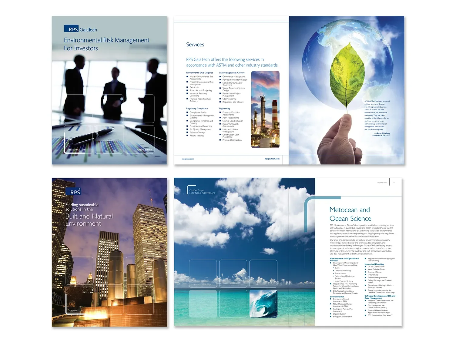
I have designed books for K-12 students and university-level textbooks, drawing on experience in the publishing industry. Transitioning into the tech sector, I expanded my expertise to include annual reports and multi-page corporate booklets for sales meetings and conferences.
Publication Design
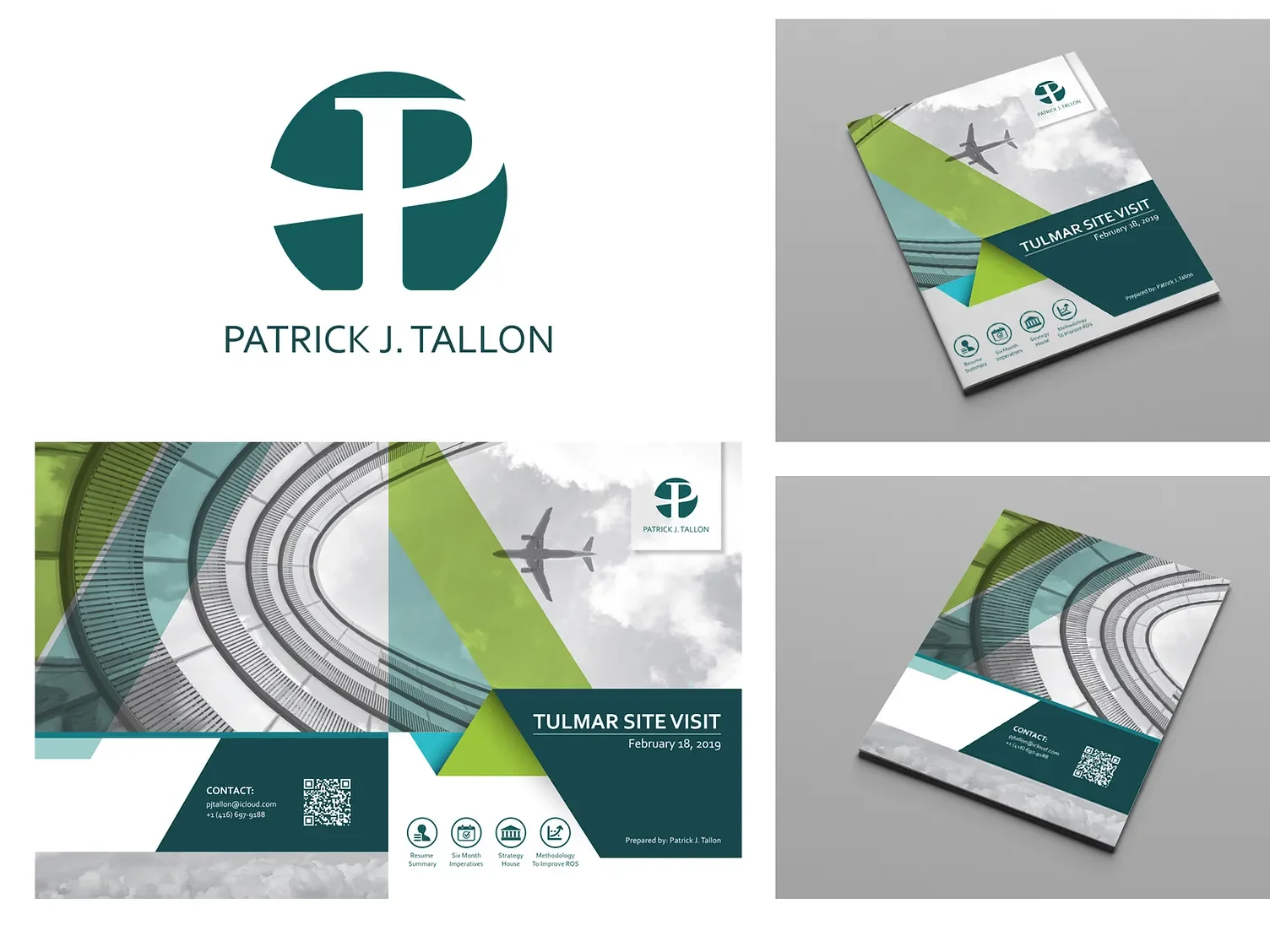
Designed a premium executive branding package to support a C-suite candidate pursuing the role of President and COO. The project included a personal identity, presentation brochure, and supporting collateral that communicated leadership philosophy, business strategy, and measurable results. The cohesive visual identity elevated the candidate’s professional presence—and he ultimately secured the position.
I also developed a personal logo based on his initials, creating a distinctive mark that reflected leadership, momentum, and resilience. The identity extended across printed collateral to present a polished and consistent executive brand.
Executive Personal Brand