
Graphic Design
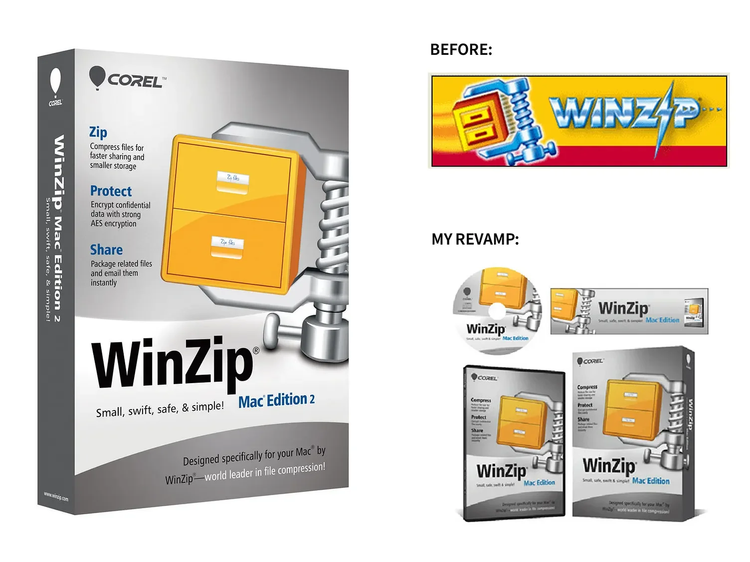
The packaging design for WinZip Mac Edition adopted a distinct approach compared to its Windows counterpart. A larger, tilted version of the iconic vice graphic was featured, extending seamlessly onto the spine of the box to create visual continuity. The background was rendered in a brushed metal style, while the traditional beveled lettering was replaced with bold Helvetica Black typography. Collectively, these design choices establish a cleaner, more modern aesthetic that aligns with contemporary Mac design sensibilities.
Logo update
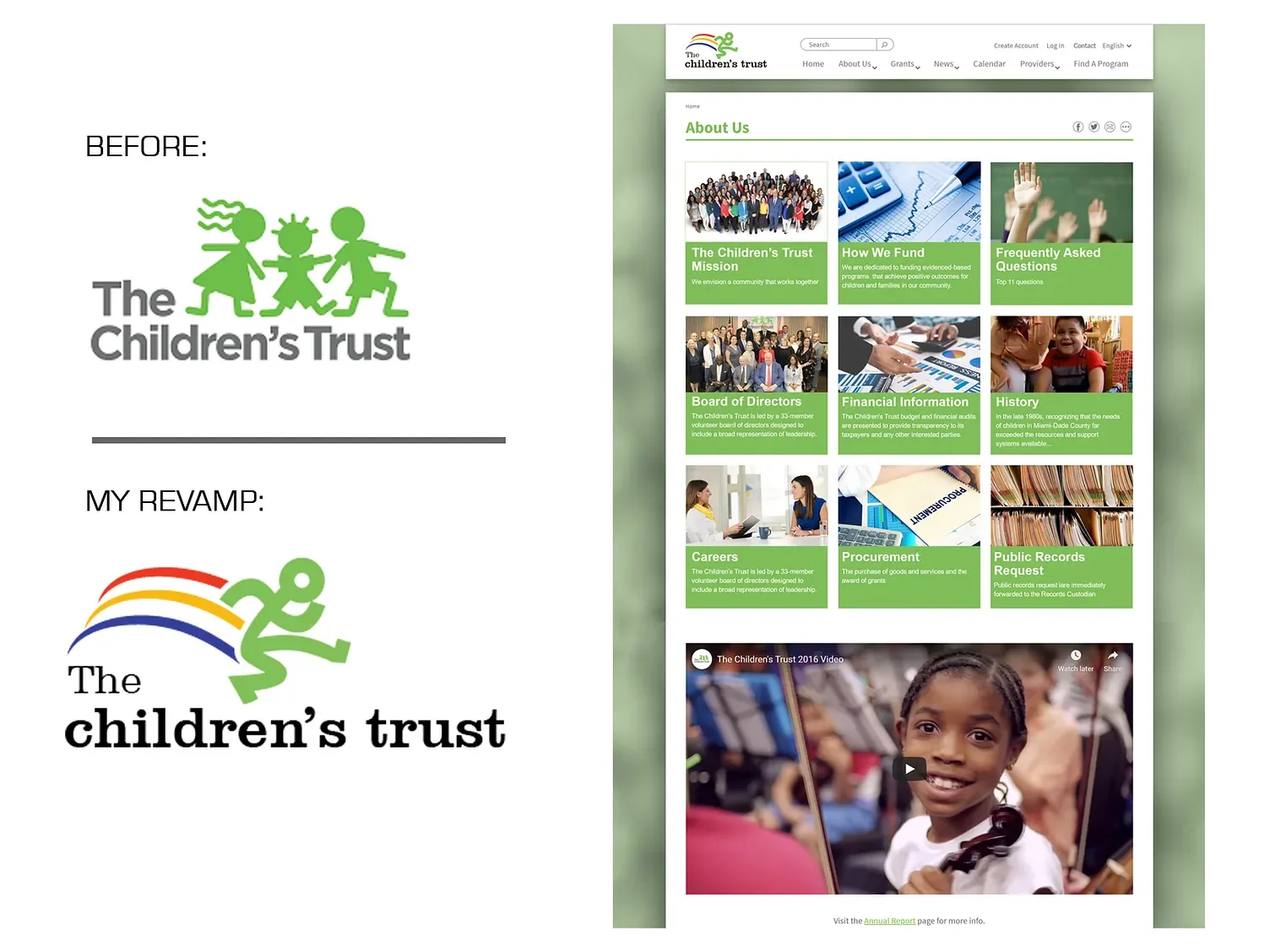
The original Children’s Trust logo relied on dated graphics and typography that did not reflect the organization’s forward-thinking mission or connect with today’s audience. My revamped logo delivers a fresh, contemporary identity: the simplified figure conveys inclusivity and energy, while the dynamic rainbow arc evokes hope and optimism. Modern typography balances approachability with credibility, ensuring the brand feels relevant and inviting to both children and families in Miami-Dade. This redesign elevates the visual presence of The Children’s Trust, positioning it as a vital, innovative resource for the community.
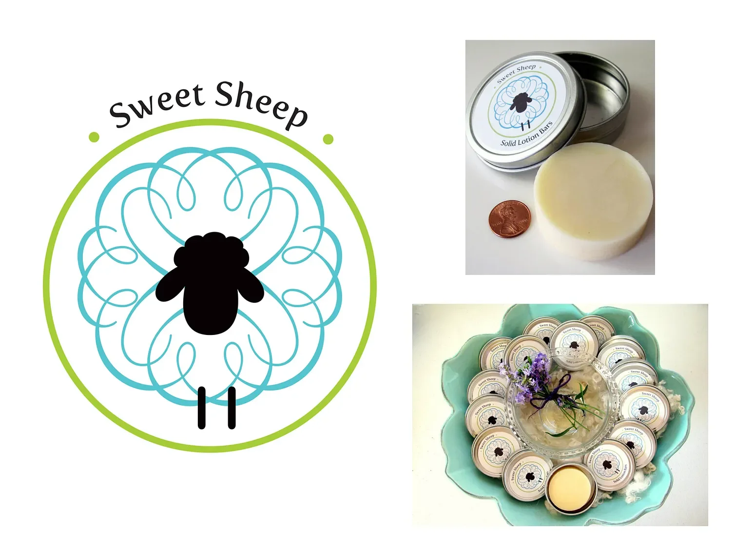
Sweet Sheep is a line of all-natural, handcrafted lotion bars formulated with lanolin, one of nature’s most effective moisturizers and the product’s key ingredient. The brand name, Sweet Sheep, was inspired by the natural source of lanolin, which is extracted during the processing of wool for textiles.
The packaging design features a stylized, elegant sheep motif whose graceful curves echo the feminine, floral, and clean fragrance notes of the collection. The circular form not only enhances the visual harmony of the design but also ensures practical functionality—providing an ideal canvas for the lid label and serving as a stamp element for the lotion bar itself.
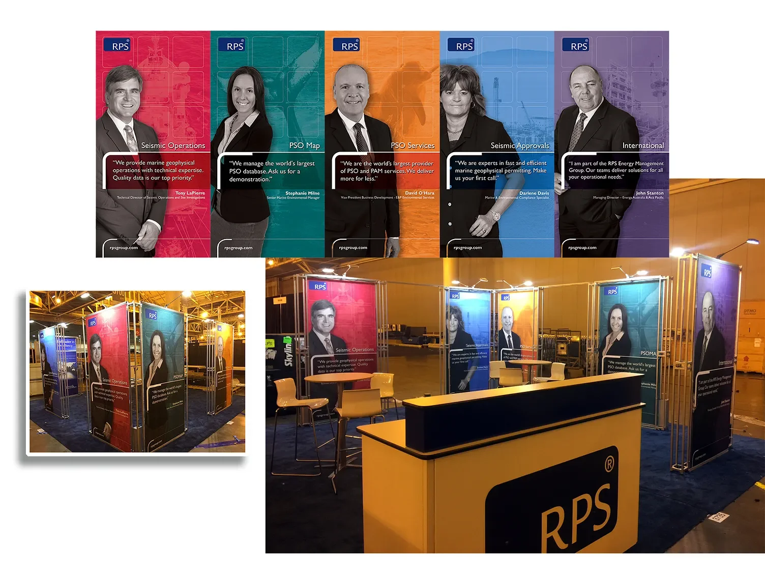
The use of real employees in the booth design helps humanize the RPS brand, drawing more attention than generic technical imagery typically would. At the Society of Exploration Geophysicists (SEG) Conference, RPS highlighted its services supporting the energy sector—a field that is both highly technical and, at times, controversial. Featuring actual staff members created a more approachable and authentic impression, particularly since the individuals depicted were present onsite, engaging with attendees at the booth.
The visual execution combined black-and-white employee portraits with colorful, discipline-specific backgrounds overlaid with subtle watermarks. This contrast not only reinforced the connection to each employee’s area of expertise but also added vibrancy and visual interest, differentiating the booth in a crowded trade show environment.
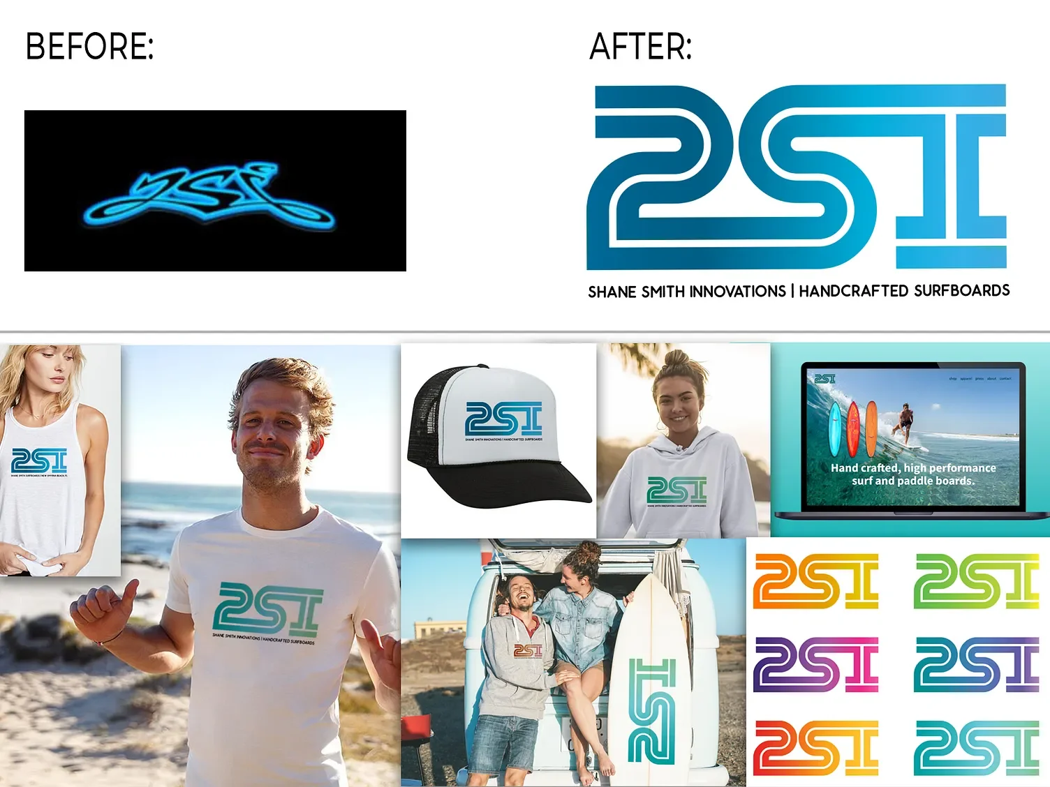
This project involved redesigning a previously graffiti-inspired logo that lacked legibility. I retained its organic, flowing essence while updating the style for greater clarity and modern appeal. The result is a clean, simple mark that is highly versatile across applications. By emphasizing readability and contemporary design, the new logo is memorable, timeless, and well-suited to the brand’s identity.

I designed a simple, memorable flower logo inspired by the letter “K” to reflect Kawalsa’s all-natural, organic focus. The label incorporates the flower’s texture to frame the text, while the lid sticker features an enlarged logo with the brand URL. Packaging was created to accommodate a wide range of flavors, from classic to exotic, ensuring a cohesive and versatile brand identity. Additional collateral includes the website, business cards, and trade show displays.
I have designed books for K-12 students and university-level textbooks, drawing on experience in the publishing industry. Transitioning into the tech sector, I expanded my expertise to include annual reports and multi-page corporate booklets for sales meetings and conferences.
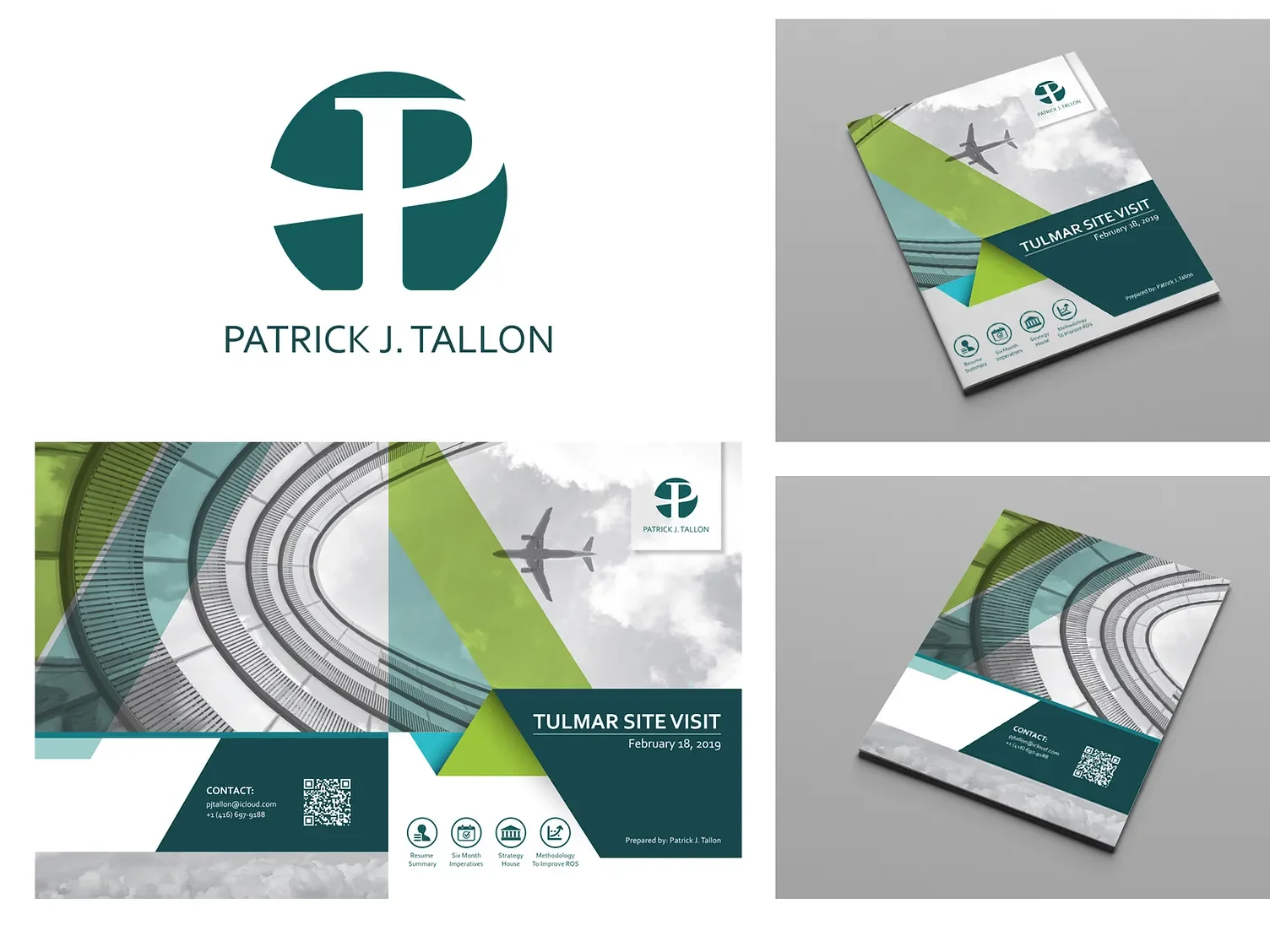
My client was pursuing an executive role as President and COO at Tulmar Safety Systems and needed a promotional piece for his interview outlining his resume, business strategy, and sales growth methodology. The simple yet elegant tabloid brochure, printed on semi-gloss stock, effectively conveyed his expertise, achievements, and vision for the company—and he secured the position.
I also designed his personal logo using his initials, P.J.T., overlaid on a circular shape symbolizing energy, movement, and resilience—qualities that define his leadership style. The green color palette reflects growth and harmony, aligning with his values and approach.