
Carnival® and the Carnival logo are trademarks of Carnival Corporation. This project is unaffiliated fan/concept work created for portfolio purposes.
Carnival - A Cruise Search Update
Role: UX/UI Designer
Team: Solo project (Personal)
Tools: Figma
Project Note:This is a self-directed redesign of a real gap I found on carnival.com — it’s not a shipped project. There's no production data or business-impact metrics below; the Results section frames what I'd want to validate, not what happened.
Problem statement: Carnival's cruise search already supports precise date-range filtering — it's just not available where customers first look for it. The homepage search widget only accepts a Months selection (e.g. "Dec 2026"). The more precise Date Range control only appears as a secondary filter after a customer has already run that broad search and landed on results.
That sequencing creates two problems. First, customers who already know their exact travel window — a specific long weekend, a fixed set of days off — can't act on that intent until after an extra, unnecessary search step. Second, when a specific date range turns out to have no matching sailings, the experience is a hard stop: an "Oh Snap", we were unable to locate an exact match" dead end that sends the customer back to Start New Search, discarding everything they'd already specified.
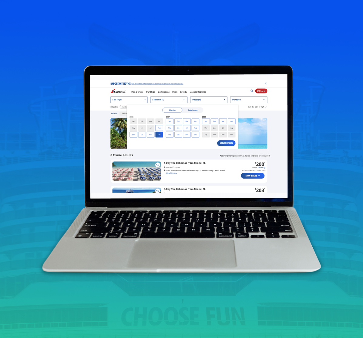
The homepage search widget only accepts a Months selection (e.g. "Dec 2026").
When no sailings match the selected dates, customers hit an “Oh Snap” dead end and must start a new search—losing all their previous criteria.
Objective
Let customers express exact-date intent from the first interaction, not only after running an initial broad search.
Preserve the existing Months search for customers who are still flexible — the goal is to add a path, not force precision nobody has yet.
Replace the dead-end "no matches" state with a recovery path that keeps the customer inside the booking flow.
Stay inside Carnival's existing system — Build on what’s already there, the Date Range option already exists. The improvement is making it easier to find at the right time, not creating a new feature.
Actions
I redesigned three moments in the flow, working forward from the actual gap rather than proposing a new pattern from scratch.
UX Optimization: Date Range is discoverable from the first interaction - users can specify exact dates upfront without needing to do a general search first.
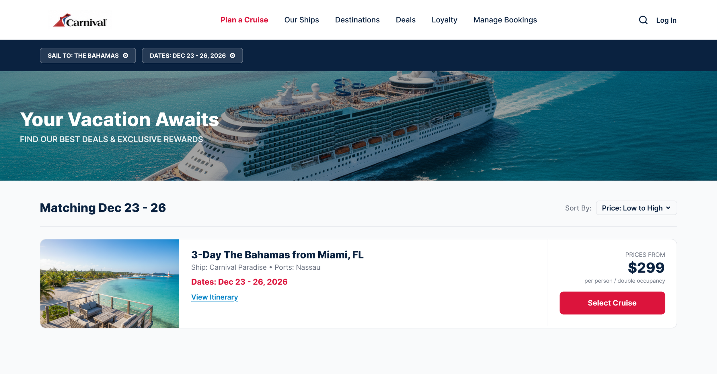
UX Optimization: Results display for selected date range. No second search step required.
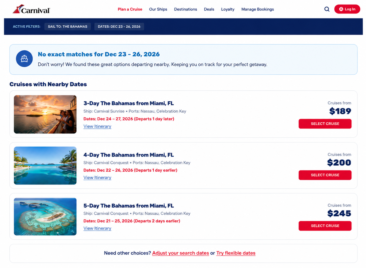
UX Optimization: Recovery not restart - alternative cruises near selected dates keep the customer in the booking flow instead of forcing a complete search reset. The two links at the bottom offer two ways forward, not one. “Adjust your search dates" reopens the calendar with the original selection intact; "Try flexible dates" widens the search to the full month, letting the customer choose between staying precise or loosening intentionally, instead of just starting over.
Design Decisions
Pressure Testing My Hypothesis
Results
This is a self-directed concept, so there's no production data to report. What I'd track if this shipped, and the open questions I'd want usability testing to answer first:
Search-to-results drop-off: whether surfacing Date Range upfront reduces the share of customers who run a broad Months search, find the result set too broad, and abandon before refining — compared against the current Months-only entry point.
Recovery engagement: whether "Select Dates" on a nearby-sailing card gets chosen more often than "Start New Search" does today, as a proxy for whether the recovery pattern actually keeps people in the flow.
Toggle usage split: how often customers choose Months vs. Date Range when both are available from the start — this would tell me whether the assumption that "some customers already know exact dates" holds up, rather than treating it as settled.
Next step before treating any of this as validated: moderated usability testing comparing the current Months-only entry point against this Date Range–first version, plus a first-click test on the recovery state to see whether customers actually notice "Select Dates" as a viable path forward.
Conclusion
Before finalizing the design direction, I wanted to ground the “surface exact dates earlier” hypothesis in something beyond my own intuition. I approached it from two angles. First, I reviewed Baymard Institute’s travel-booking research, which shows that a meaningful subset of travelers arrive with a defined travel window and use the calendar primarily to confirm availability rather than discover when to travel. While that research focuses on airline booking and isn’t direct evidence of cruise behavior, it provides a relevant behavioral pattern worth exploring. Second, I used AI as a structured thought partner to pressure-test my hypothesis by identifying underlying assumptions, generating competing explanations for the observed friction, and considering alternative design strategies. Rather than reinforcing my initial idea, this process challenged it and clarified what would need to be validated through user research. Taken together, the external research and assumption testing increased my confidence that surfacing Date Range earlier is a hypothesis worth testing—not a conclusion already proven.
The infographic below summarizes the external research that informed this concept.